Styling your first webpage with CSS
Update April 2026: A more beginner friendly and comprehensive version of this tutorial now exists. I wrote a free web book called HTML for People. In particular, there is a bonus chapter called CSS Basics that covers these concepts. Check it out.
This article is part of a series:
- Your first webpage with HTML and Netlify
- Styling your first webpage with CSS (you are here)
If you’ve followed along, then you’ve created your very own webpage using HTML and put it on the web using Netlify. You probably noticed that it’s very plain-looking. That’s because we haven’t specified how anything should look. By default, the browser applies some basic styles—headings are big and bold, lists are indented, links are blue and underlined.
These default styles get the point across and make the site usable, but we could definitely make some improvements and use our own sense of style to add some personality. Design on the web is a big, wonderful world, with many resources to help yourself learn and improve. Here’s a great book on web design made for non-designers.
That said, for this article, we’re going to keep things simple and focus more on how to write CSS than how to create a great design. As you get better at HTML and CSS, you will be able to do more and you will need to follow design principles to keep your websites from becoming cluttered and chaotic. Fortunately, our site only has a little content.
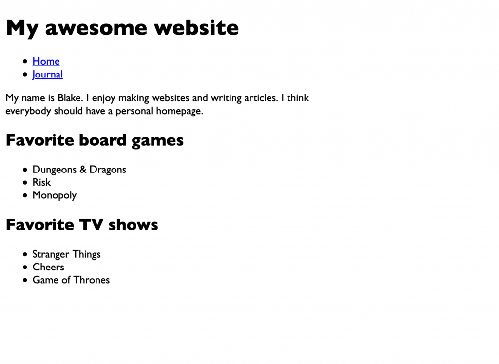
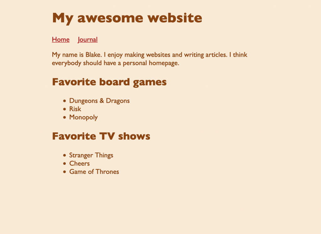
As a reminder, here’s an example of the unstyled website we created in the last article.
If you want see what styles we’ll be adding to this page, check out the styled version of the website.
The <style> tag
CSS, or Cascading Style Sheets, is the language that we use to describe the appearance of our webpages. Any CSS styles that we add get applied to our webpage in addition to the basic styling that the web browser has already supplied.
Where do we write CSS? Well, remember that our
index.html document contains a
<head> section that has information about the page
that is invisible to the user.
<!DOCTYPE html>
<html>
    <head>
        <meta charset="UTF-8">
        <title>My awesome website</title>
    </head>
    <body>
        <h1>My awesome website</h1>

        <ul class="menu">
            <li><a href="index.html">Home</a></li>
            <li><a href="journal.html">Journal</a></li>
        </ul>

        <p>My name is Blake. I enjoy making websites and writing articles. I think everybody should have a personal homepage.</p>

        <h2>Favorite board games</h2>

        <ul>
            <li>Dungeons & Dragons</li>
            <li>Risk</li>
            <li>Monopoly</li>
        </ul>

        <h2>Favorite TV shows</h2>

        <ul>
            <li>Stranger Things</li>
            <li>Cheers</li>
            <li>Game of Thrones</li>
        </ul>
    </body>
</html>
We can add a <style> tag inside the
<head> tag that will contain all of our CSS code.
<head>
    <meta charset="UTF-8">
    <title>My awesome website</title>
    <style>
        ...CSS code goes here...
    </style>
</head>
Great, let’s write our first CSS rule.
<style>
    body {
        font-family: "Gill Sans", sans-serif;
    }
</style>
This rule changes the font of everything inside the
<body> tag to Gill Sans, if available on the user’s
device. If not, it tells the browser to use a default sans-serif font.
1
Save the file and open it up in a web browser (File > Open File…).
Anatomy of a CSS rule
Let’s look a little more closely at what we did in that example.
Here’s the code again (from now on I’m omitting the
<style> tag in these samples, but that is where the
CSS code lives for now).
body {
    font-family: "Gill Sans", sans-serif;
}
That first bit, body, is called a selector. You
might say it selects the parts of your page you wish to
style.
The line inside the braces ({}) is a
property and value. The property in this example is
font-family, which controls what font you want to use.
The value is "Gill Sans", sans-serif, which tells the
browser, “I would like to use Gill Sans but if the user doesn’t have
it, use any sans-serif you have.” Note that a ; goes at
the end of the property/value line.
You can add multiple properties to a rule. For example, let’s make the width of our page more narrow so that users with wide screens don’t have to follow the text all the way across the screen.
body {
    max-width: 500px;
    font-family: "Gill Sans", sans-serif;
}
We just set the max-width property of the
body to be 500px. That means the width of
our page will never exceed 500 pixels in width. Any text that would go
beyond that width will instead be wrapped around to the next line.
It doesn’t really matter what order the properties go in, but I have my own preferences I tend to follow. The important thing is that, whatever ordering scheme you decide on, you be consistent.
As you can probably imagine, there are quite a few properties that you can use. In time, you will begin to remember the common ones offhand. But if you aren’t sure what property you need or you just want to see what’s available, check out the MDN CSS Reference (it’s a long list, but remember that you only need a handful for now—there’s no need to memorize this list.
Adding more styles to the page
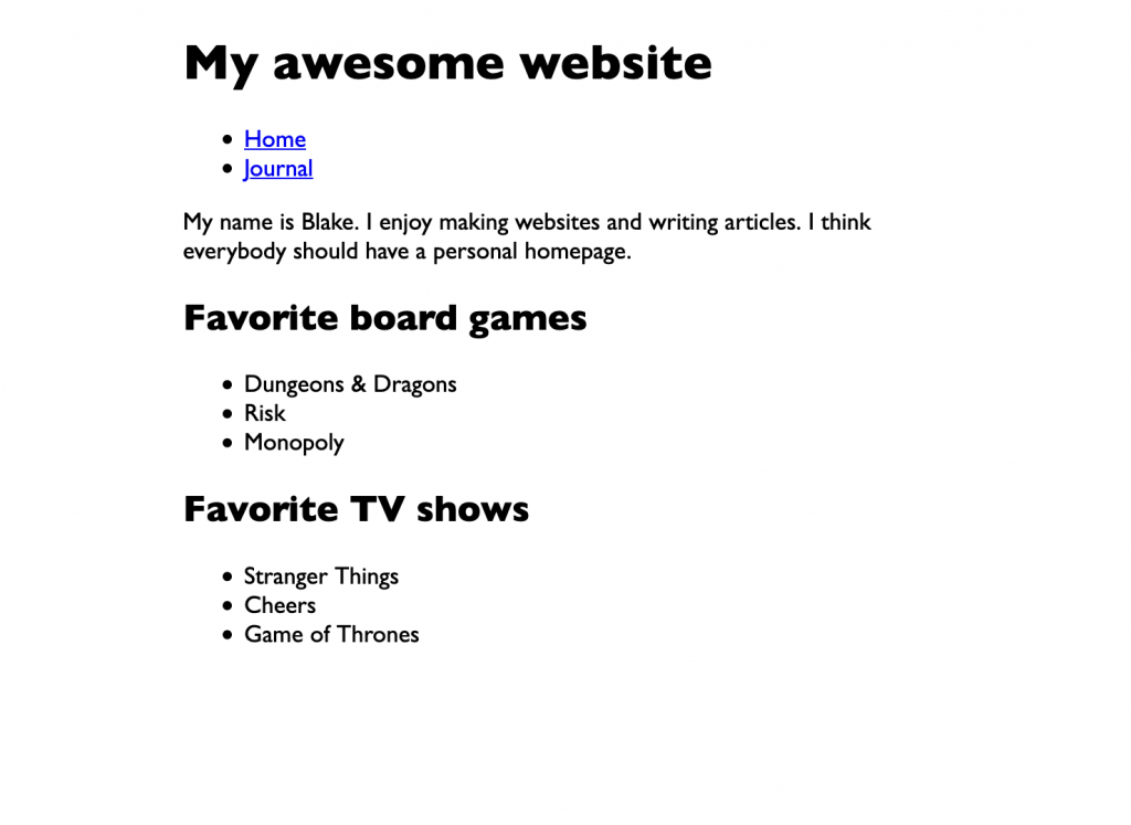
Let’s look at our styling progress up to now.
So far, so good. But we should probably make the page a bit more centered so that people with wide screens don’t have to stare off to the left side so much.
We’re going to use the margin property, which controls
the space around an element. Specifically, we’re using
maring-left and margin-right, like this:
body {
    margin-left: auto;
    margin-right: auto;
    max-width: 500px;
    font-family: "Gill Sans", sans-serif;
}
We could have specified a pixel value here, but by using the
auto keyword, we’re telling the browser that we want an
even amount of margin to the left and right of the page. The result is
that the page is centered in the browser window.
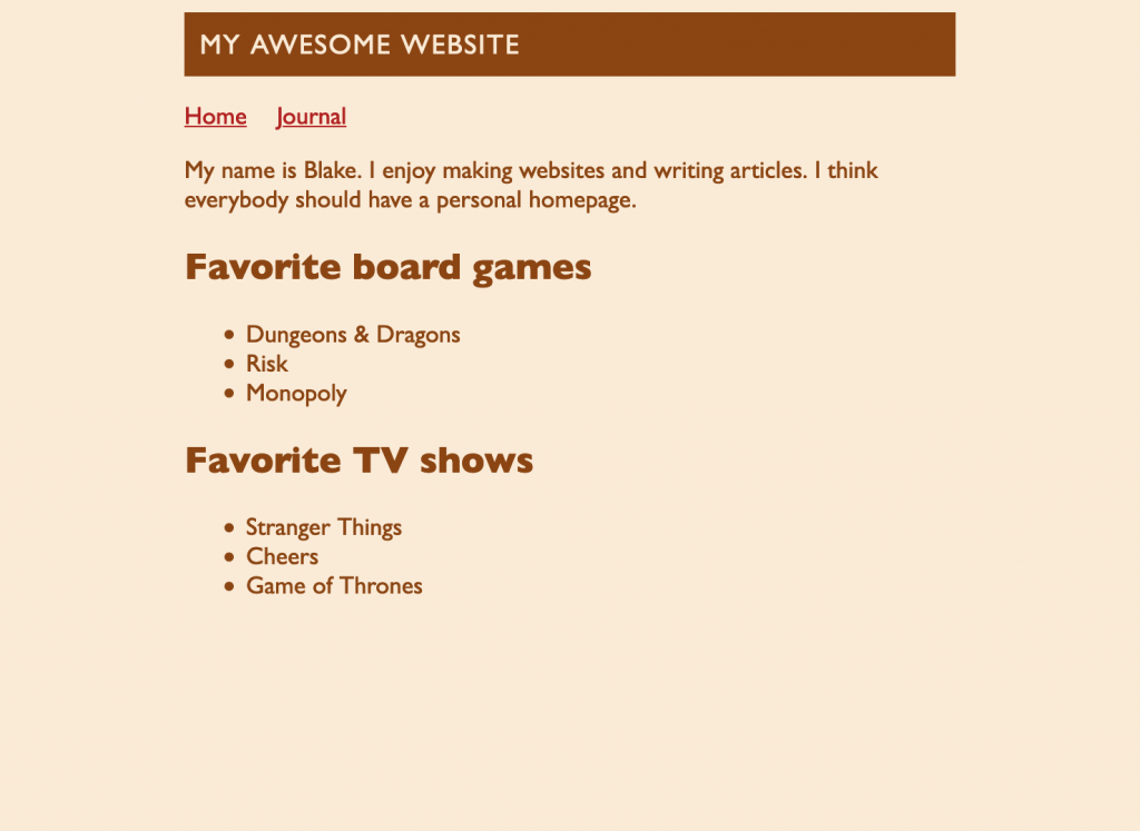
Okay, cool. Let’s try changing some colors.
body {
    margin-left: auto;
    margin-right: auto;
    max-width: 500px;
    font-family: "Gill Sans", sans-serif;
    background-color: antiquewhite;
    color: saddlebrown;
}
That will give us:
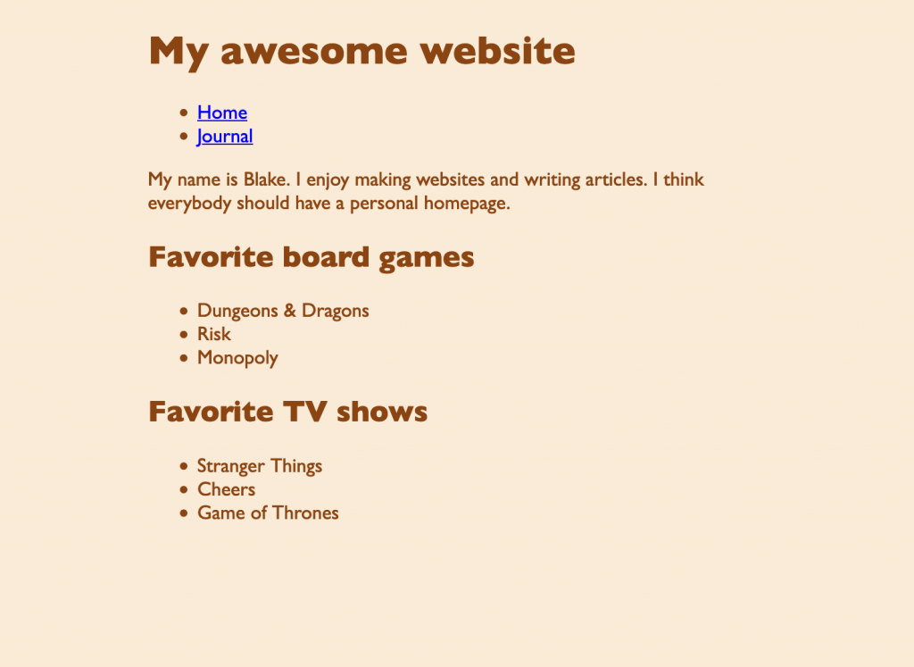
Woo hoo, colors! We’re setting the
background-color property, which defines the color of
empty space, the background of the page. We’re also setting
color, which controls the color of text on the page.
There are different ways to reference colors in CSS. We’re using color keywords for ease of use. You can see the whole list of available color keywords, as well as other ways to represent colors, on this MDN CSS color reference.
We’re not going to win any design awards for the color choices here, but it’s my webpage and I can do what I want. 2
Styling links
By default, links are blue. But that isn’t sitting well with with the warm colors we chose. Let’s change it to something warmer.
a {
    color: firebrick;
}
We’re creating a new rule. We want to target all of the
<a> elements on the page. We can do that by using
a as the selector. Remember that
color controls the text color. We’ll make it a reddish
color.
For fun, let’s make it so that the color of the link changes when you hover the mouse over it. We’ll need a new rule for this, with a slightly different selector. We don’t want to target every link, only the one the mouse is being hovered over. CSS has a special syntax for selecting elements that are in a certain state, like being hovered over.
a:hover {
    color: crimson;
}
This selector says, if a link is in the hover state, apply this rule. In this example, we’re just changing the text color.
Meaning vs. appearance
Let’s make our navigation links sit horizontally in a row rather than stacked in a bulleted list. Remember, our list of links looks like this:
<ul>
    <li><a href="index.html">Home</a></li>
    <li><a href="journal.html">Journal</a></li>
</ul>
You might think, “Well if I don’t want a bulleted list, I’ll just change the HTML.” But in this case, we aren’t changing the meaning of the menu—it is still a list of links. It’s just that we’re changing the way it looks by tweaking the layout and removing the bullets.
So we’ll keep the HTML the way it is. But we’ll add some CSS to change the appearance.
ul {
    padding-left: 0;
    list-style: none;
}
First, we’ll target the list as a whole. We’ll set
padding-left to 0 to remove the indentation
(padding is similar to margin, but we’ll discuss the difference
later). You can use list-style to change the bullet type,
but we’re setting it to none so that the bullets are
removed altogether.
Next, we’ll target the individual list items, or
<li> elements.
li {
    display: inline-block;
    margin-right: 15px;
}
Setting the display property to
inline-block will cause the list items to sit next to
each other in a row. We’ll add a little margin-right to
the list items so that they are spaced apart nicely.
But notice, there’s a problem:
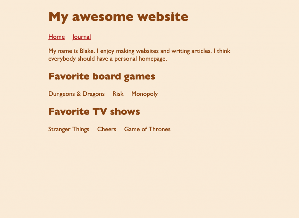
By attempting to style our menu list, we inadvertently styled all of our lists. We don’t want that. But how do we target only the menu list? We can give it a name.
<ul class="menu">
    <li><a href="index.html">Home</a></li>
    <li><a href="journal.html">Journal</a></li>
</ul>
We can give any element the class attribute to give it
one or more names (separated by spaces) that we can use in our CSS.
Let’s adjust our CSS to use the new name.
.menu {
    padding-left: 0;
    list-style: none;
}
We changed the ul selector to .menu. When
using class names in CSS, we start them with a dot.
We can use this same name to target our list items.
.menu li {
    display: inline-block;
    margin-right: 15px;
}
This selector is saying, “target all list items that are inside an element with the class name of menu.”
Now that both of our rules are specifically targeting the
menu class name, our regular lists have reverted back to
their original look.
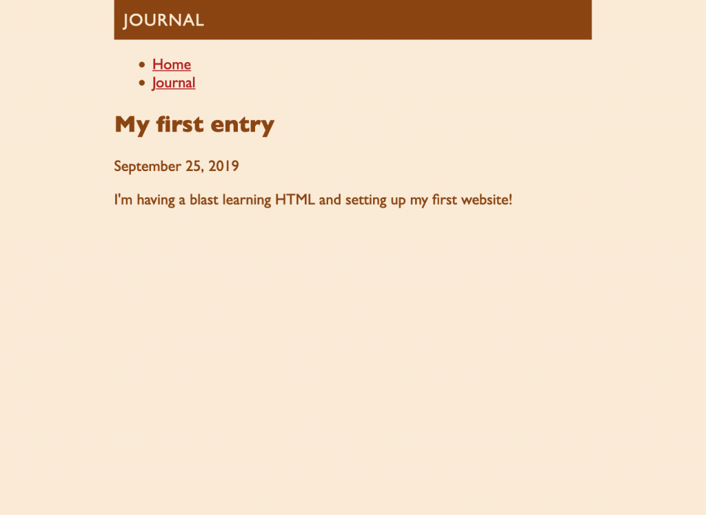
Styling the site header
Let’s do something fun with the site header. Hopefully you are starting to get the idea of how these CSS rules work—first you specify a selector, then a list of properties you want to change. This article is already getting long, so I’ll just drop in the code rather than describe each property. I encourage you to play around with the values to see how they work.
h1 {
    margin-top: 0;
    padding: 10px;
    font-size: 18px;
    font-weight: normal;
    text-transform: uppercase;
    letter-spacing: 1px;
    background-color: saddlebrown;
    color: antiquewhite;
}
This code produces the following look.
One thing I want to point out—this rule demonstrates the difference
between padding and margin. I gave <h1> some
padding to provide some space within its box, to give the text a
little padding between it and the edge of the box. On the
other hand, margin controls the space around the outside of
the box.
I really want the <h1> to touch the top of the
viewport, but, by default, there’s a little margin all around the
<body>. We’ll go back and modify our body rule to
get rid of the top margin.
 body {
    margin-top: 0;
    margin-left: auto;
    margin-right: auto;
    max-width: 500px;
    font-family: "Gill Sans", sans-serif;
    background-color: antiquewhite;
    color: saddlebrown;
}
There we go. Our homepage is looking good.
Reusing CSS across different pages
We would like to apply all of the styles we wrote for the homepage to
our journal page. One way to do that is to copy and paste our
<style> tag and all its contents to
journal.html. That would work, but what if we decide to
make a change, such as choosing a different color for links? We would
probably want to change the link color on both the homepage
and the journal. That means editing two different files.
Making changes would become more and more difficult for each
additional page we add to our site.
Fortunately, there’s a better way. We’ll use an external style sheet.
We’ll take all of our CSS out of index.html and put it
into a separate file. Then we’ll make both the homepage and journal
reference that file.
First create a separate file and name it style.css (you
can name it whatever you like so long as it ends in
.css). Then copy everything between the
<style> and </style> tags (but
not the tags themselves) and paste it into your new CSS file.
Next, edit index.html by adding a
<link> tag to the <head>:
<head>
    <meta charset="UTF-8">
    <title>My awesome website</title>
    <link rel="stylesheet" href="style.css">
</head>
This bit of code links your HTML file with your CSS file. Now
index.html knows that you have CSS rules that it should
use in style.css.
Go ahead and make the same change to journal.html. Once
you do, the journal page should be receiving all of your custom
styles.
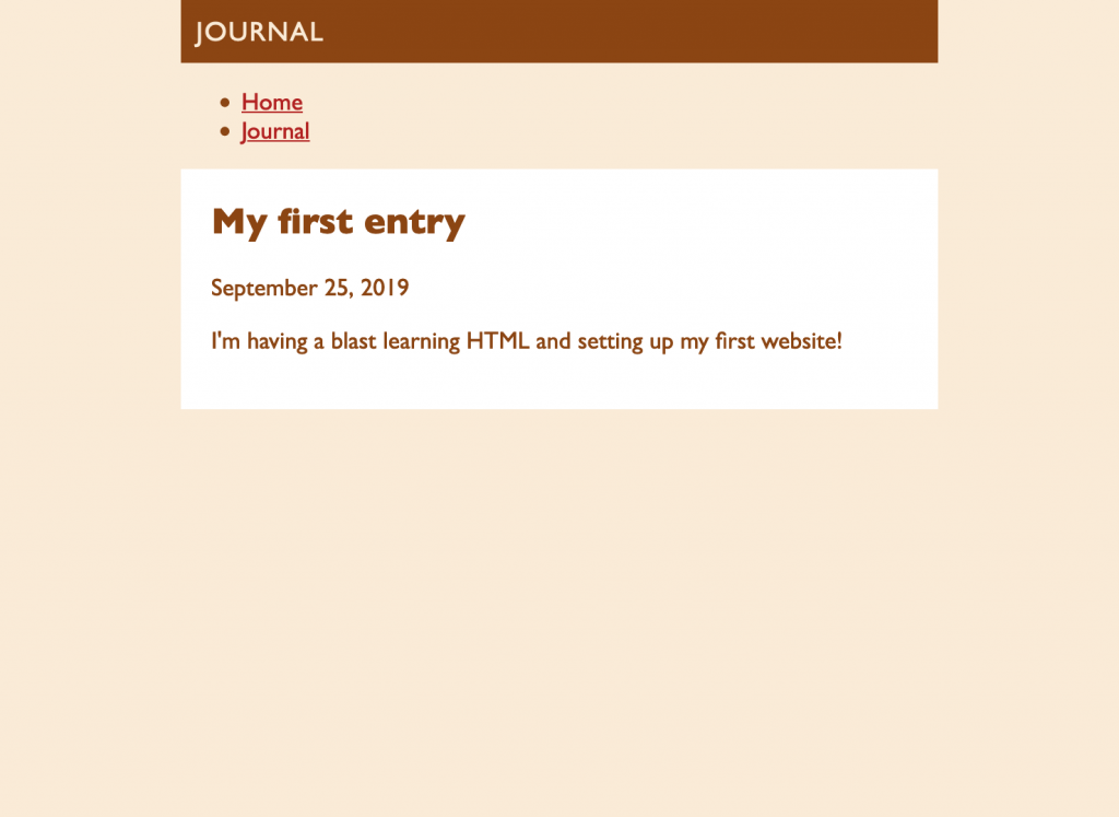
Styling articles
Let’s spruce up our blog article by making it appear on a white card.
Add this rule to style.css:
article {
    padding: 20px;
    background: #fff;
}
That’s nice. But why is there so much space above the heading? It’s
because the <h2> has top margin by default. But we
can remove it.
article h2 {
    margin-top: 0;
}
This rule is targeting every <h2> that appears
inside an <article> and removing its top margin.
That’s looking better.
Let’s update our journal by adding another article. It should automatically receive the correct styles so long as we use the same HTML structure.
Blog articles usually appear with the newest ones first, so let’s add another article right above the first one.
<article>
    <h2>My second entry</h2>

    <time datetime="2020-01-12">January 12, 2020</time>

    <p>I added some CSS to my website. It’s very stylish.</p>
</article>
It received the styles but something isn’t right—the cards are touching, causing them to appear like one giant card.
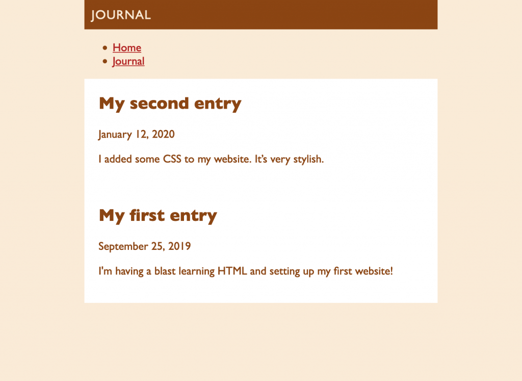
Not to worry, we can add some bottom margin to each article. Adjust
the article rule like so:
article {
    margin-bottom: 20px;
    padding: 20px;
    background: #fff;
}
Which produces:
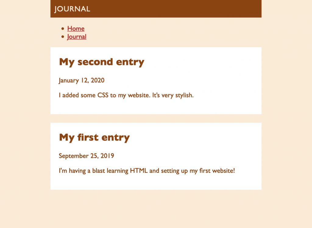
Much better. One last issue. Our menu appears to have lost its
horizontal styling. That’s because we need to add the
menu class name to our menu list. Make the following
adjustment in journal.html.
<ul class="menu">
    <li><a href="index.html">Home</a></li>
    <li><a href="journal.html">Journal</a></li>
</ul>
Looks great! You can check out the final journal page here.
Publishing your changes
Head back into your Netlify dashboard and go to the Deploys tab. At the bottom of the page you will see a box where you can drag and drop your website folder (just make sure you’ve saved all the files).
That’s it! Your website should have been updated to reflect the latest changes.
Conclusion and bonus challenge
If you have followed all the way through, you deserve a cookie and a pat on the back! You not only created your own website from scratch using HTML, you also made it look stylish by using CSS.
If you are thirsty for more, here’s a challenge for you. Adjust your menu so that the current page is in bold and not linked (hint: you could use a special class name).
- Most web browser’s default to Times New Roman, which is a serif font. There’s nothing wrong with Times New Roman, necessarily, but many webpage authors will change it just because it is the default font. If you want to go down the rabbit hole of the art and science of typography — which I totally recommend you do — check out Butterick’s Practical Typography. ↩
- That said, if you want people to actually be able to read your webpage, you want to choose background and foreground colors that contrast well. You can use this color contrast checker to make sure your text is easy to see. ↩